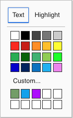
The textbox.io color widget offers customisation to adjust the available colour buttons. These changes apply to all features where the widget is used:
- Font and Highlight color
- Table Cell Border
- Table Cell Background
The widget will grow or shrink vertically as required to accomodate the list of colors. The column count is not configurable.
This API was introduced in Textbox.io release 2.4.1
The custom colour picker was added in Textbox.io release 2.4.2
Default colors
The default set of colors includes a color name used for the tooltip and ARIA label. These names are translated to all supported languages, and the API allows use of these translations. To use a translated name, set the text of a custom color to one of the Translation Key entries from this table; translation even works if the text is not provided but the color matches a translation key.
The default colors, in order, are:
| HTML color value | Translation Key | English Color Name |
|---|---|---|
#FFF | white | White |
#000 | black | Black |
#444 | gray | Gray |
#777 | metal | Metal |
#CCC | smoke | Smoke |
#FC1D00 | red | Red |
#C81500 | darkred | Dark Red |
#FF8C00 | darkorange | Dark Orange |
#FEBE00 | orange | Orange |
#FFFC00 | yellow | Yellow |
#22AE50 | green | Green |
#006400 | darkgreen | Dark Green |
#3CB371 | mediumseagreen | Medium Sea Green |
#8FCD4E | lightgreen | Light Green |
#00FF00 | lime | Lime |
#0000CD | mediumblue | Medium Blue |
#002360 | navy | Navy |
#0173C1 | blue | Blue |
#14B2F2 | lightblue | Light Blue |
#EE82EE | violet | Violet |
Properties
| Property | Type | Default | Value |
|---|---|---|---|
buttons | Array | All colors listed above, in order | An array of color button objects to show on the widget |
custom | Boolean | true | Whether to show a custom color picker option below the buttons |
Color Button objects
| Property | Type | Value |
|---|---|---|
value | String | The HTML color representation. This string will be set as the color in the document without additional processing. While the default colors all use hex representation, any valid HTML color value can be used. |
text | String (optional) | Text representation used for the tooltip and ARIA label of the color button. See note above about translations. If no text is provided, the |
Example Configuration
This example demonstrates a color configuration where a single row of 5 buttons are shown.
The first three take advantage of the fact that translation keys are also valid HTML color names. The fourth supplies a custom string, and the fifth replaces one of the built-in colors by using a custom color value and a translation key for the text.
